

- Select City


Share:


When guests judge an Airbnb bedroom, they rarely think in design terms. They don’t say “This colour palette is cohesive” or “The undertones work well.” What they feel instead is something much simpler.
Calm.
Rested.
Comfortable.
Or the opposite.
Colour plays a major role in shaping that feeling. In an Airbnb, especially in the bedroom, colour isn’t about personality or expression. It’s about creating a space that helps strangers sleep well, relax quickly, and feel at ease.
Here’s how colour psychology influences guest experience and which bedroom colour schemes consistently perform best in short-term rentals.


Why Bedroom Colours Matter More in Airbnbs
In your own home, bold colours can feel exciting or expressive. In an Airbnb, they can feel overwhelming.
Guests arrive tired, overstimulated, and unfamiliar with the space. The bedroom is where they decompress. If the colours feel loud, dark, or chaotic, it affects sleep quality even if guests can’t explain why.
Bedrooms that photograph well but feel tense in person often suffer in reviews. Guests may say the stay was “fine,” but they’re less likely to rave or return.
Colour choices influence mood before comfort ever gets a chance.
The Psychology Behind Restful Bedroom Colours
Human brains associate certain colours with safety, rest, and familiarity. These associations aren’t trends—they’re biological and cultural patterns that repeat across locations and demographics.
Rest-friendly colours generally:
Reduce mental stimulation
Reflect light softly
Feel neutral rather than personal
Allow the eye to rest
The best Airbnb bedrooms don’t demand attention. They quietly support rest.
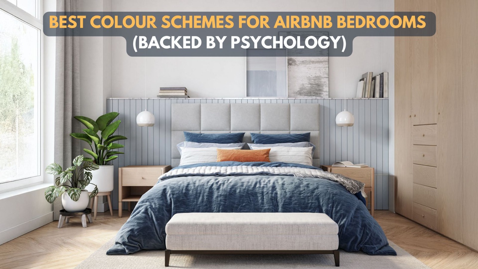
1. Soft Whites and Warm Off-Whites
White is the most misunderstood colour in Airbnb design.
Bright, clinical whites can feel cold. But warm off-whites ivory, cream, soft eggshell create a sense of cleanliness without sterility.
Psychologically, white signals:
Freshness
Simplicity
Safety
In bedrooms, warm whites work especially well when paired with:
Textured bedding
Wood accents
Soft lighting
This combination feels hotel-like, which guests trust instinctively.
2. Muted Greys (Not Cold Greys)
Grey can be calming or depressing depending on tone.
Cool, blue-based greys often feel gloomy in bedrooms. Warm, greige-toned greys feel balanced and modern without being distracting.
Muted greys create:
Visual quiet
A sense of order
A neutral backdrop for furnishings
They’re particularly effective in urban Airbnbs where guests want rest from a busy city outside.
3. Soft Beige and Sand Tones
Beige gets a bad reputation because it’s often overused poorly. When chosen thoughtfully, it’s one of the safest bedroom colours for short-term rentals.
Beige tones communicate:
Warmth
Familiarity
Comfort
They don’t polarize guests. They don’t age quickly. And they work well across lighting conditions.
In Airbnb bedrooms, beige acts as a psychological comfort blanket unnoticed, but deeply reassuring.
4. Pale Blues and Dusty Blue-Greens
Blue is widely associated with calm, trust, and relaxation. But intensity matters.
Deep blues can feel heavy. Bright blues can feel cold. Pale, dusty blues strike the right balance.
These shades:
Lower perceived stress
Feel cool without being stark
Suggest cleanliness and calm
Blue-greens (like soft sage or eucalyptus tones) add a subtle natural feel without becoming trendy or distracting.
5. Muted Earthy Greens
Green signals balance and restoration. In bedrooms, muted greens are especially effective for longer stays.
Soft greens:
Reduce eye strain
Feel natural and grounding
Pair well with neutral furniture
They work particularly well in homes with natural light, plants, or outdoor views—creating continuity between inside and outside.
Colours to Avoid in Airbnb Bedrooms
Some colours consistently underperform in guest satisfaction even if they look striking in photos.
Strong reds, oranges, and yellows can feel energizing rather than restful. Dark purples and heavy browns can feel oppressive. Black accents, if overused, make rooms feel smaller and less welcoming.
Bold colours aren’t wrong but bedrooms are not the place to experiment.
Consistency Matters More Than Individual Colours
Guests experience the home as a whole.
A bedroom colour that clashes with the living area, hallway, or bathroom creates subtle discomfort. Consistent, flowing palettes feel intentional and calming.
This doesn’t mean everything must match exactly but colours should belong to the same family.
Lighting Changes How Colours Feel
Even the best colour fails under poor lighting.
Warm lights soften colours. Cool lights harden them. Always test bedroom colours under actual nighttime lighting conditions not just daylight.
A colour that feels calm during the day can feel harsh at night if lighting isn’t right.
Final Thoughts
The best Airbnb bedroom colours don’t try to impress. They try to support rest.
Guests may never mention your colour palette but they’ll feel its effects. Better sleep leads to better mornings. Better mornings lead to better reviews.
In Airbnb hosting, comfort is rarely about luxury.
It’s about how a space makes people feel when no one is watching.